Deeper delve: Zara’s first online store
Our Digital Creative Lead, Laverne Periera, heads to Zara, Westfield Stratford City to review the new online pop-up.


Our Digital Creative Lead, Laverne Periera, heads to Zara, Westfield Stratford City to review the new online pop-up.


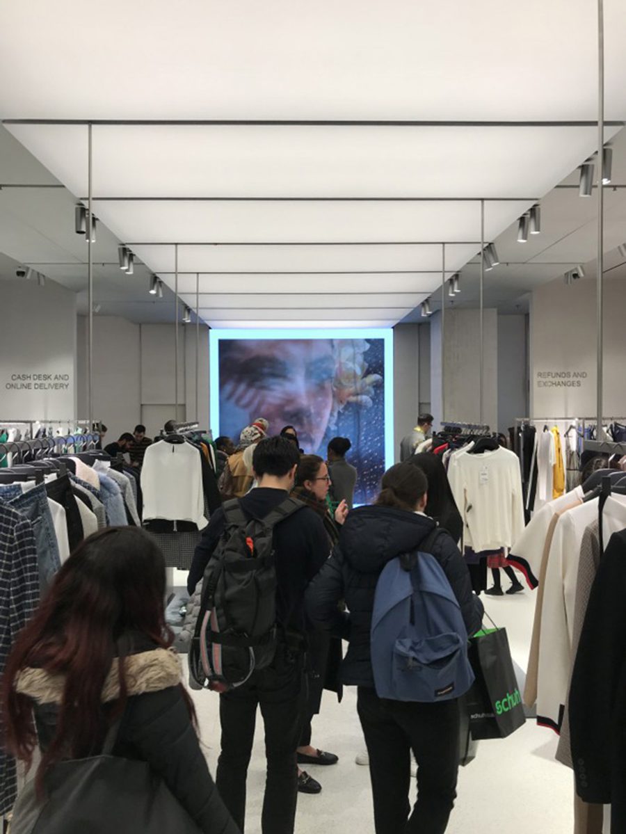
A small selection of the SS18 range is on show for customers to browse and order. In the mix are a few items which are available online only, which is good way to highlight the extended range and focus on the key trends and colours for the season.

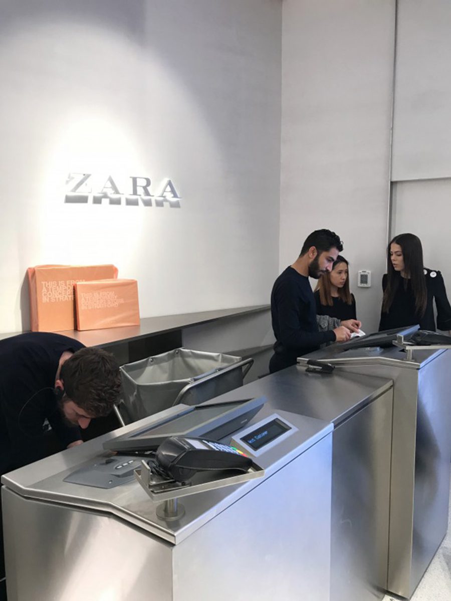
You could tell the assistants were enjoying the buzz within the store and being able to be on the shop floor interacting with customers, taking orders and payments which they said was something customers were delighted to experience.

Customers are directed to the back of the store opposite the cash desk for refund and exchanges, separating the services so it can be more focused and dedicated, as well as limiting any queue build up within the small space in this section of the store. Whilst the majority of the store comprises womenswear, a section is dedicated to a curated selection of menswear that also highlights key pieces with clusters of cross-department looks.

Before visiting the store we’d heard a lot about the mirrors, how the RFID would showcase the item you were looking at, offer complimentary looks and the ability to order. The reality was quite different, you can barely see the writing on the mirror when you stand in front of it because of the bright light radiating from within the store. A surprise appearance could be a good thing, but it did take a little while of moving around and stepping back before a visual appeared onscreen, showing a model wearing the garment. Again, the image was hard to see which defeats the purpose, and in reality, the image is lifeless. A video of the model wearing the garment would have been more useful and with so many different body types, would it look the same on everyone? Probably not.

It would have been great if the mirror recognised the customer and then mapped the product to them so they could move around and see how it looks without having to try it on. We tried a few different garments and the same clucky experience made the procedure underwhelming. There wasn’t any other related products shown or the ability to swipe through the garments views, which could have been readily available online. We were hoping for more, but perhaps in its first week, it’s starting with the simplest execution and will then build in more features? With a handful of stores introducing this tech in their retail outlets successfully, brands will have to invest time and effort on its features to really support the needs of its customer when browsing and their decision making process.
We heard online that the changing rooms in the store had featured these magic mirrors with further tech and recommendations, but when asking the shop assistants, they explained they only hold one size and there were no changing rooms for customers in the store. Confusing! Don’t believe everything you read online folks…

Overall, when we got over our expectations of it being a tech-filled store of the future, it does have the core services customers expect from an omnichannel retail store along with the introduction of mobile payments on the shop floor. The store has an additional pull factor with the curation of its online offering in a focused store design and we can see this format being rolled out. Fundamentally, Zara’s store achieves its goal to cater to its customers’ needs and offers another layer of experience, while the Stratford store is being renovated. Eliminating the hassle and bringing these services to the focus shows that Zara as a brand cares about providing the right services when necessary and opening a temporary store for its customers, which other brands could adopt when considering a refurbishment.
We look forward to seeing the ‘radical’ new store opening this year which is supposed to hold innovative technology such as a dynamic picking robot, self-checkout and smart systems to reduce emissions and save energy. Here’s hoping it lives up to the expectations it promises.

The first ever SXSW London took over Shoreditch this month, offering a wealth of inspiration and insights across tech, business and culture. We share our thinking into how it can return even bigger and better for 2026.

