We visit the new Rag & Bone Soho store
Occupying two floors on Beak Street, Rag & Bone’s new London flagship brings downtown New York cool to Soho. Here's what we made of it.

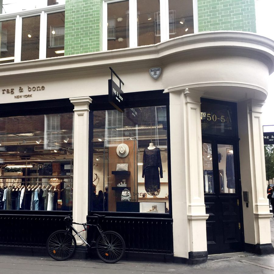
Occupying two floors on Beak Street, Rag & Bone’s new London flagship brings downtown New York cool to Soho. Here's what we made of it.


Rag & Bone is one of the few brands that truly encompasses New York downtown cool with its mix of deconstructed tailoring, rugged denim and tactile knits all infused with an offhand attitude. Last Friday Rag & Bone Soho officially launched, bringing the brand’s signature aesthetic to Beak Street.
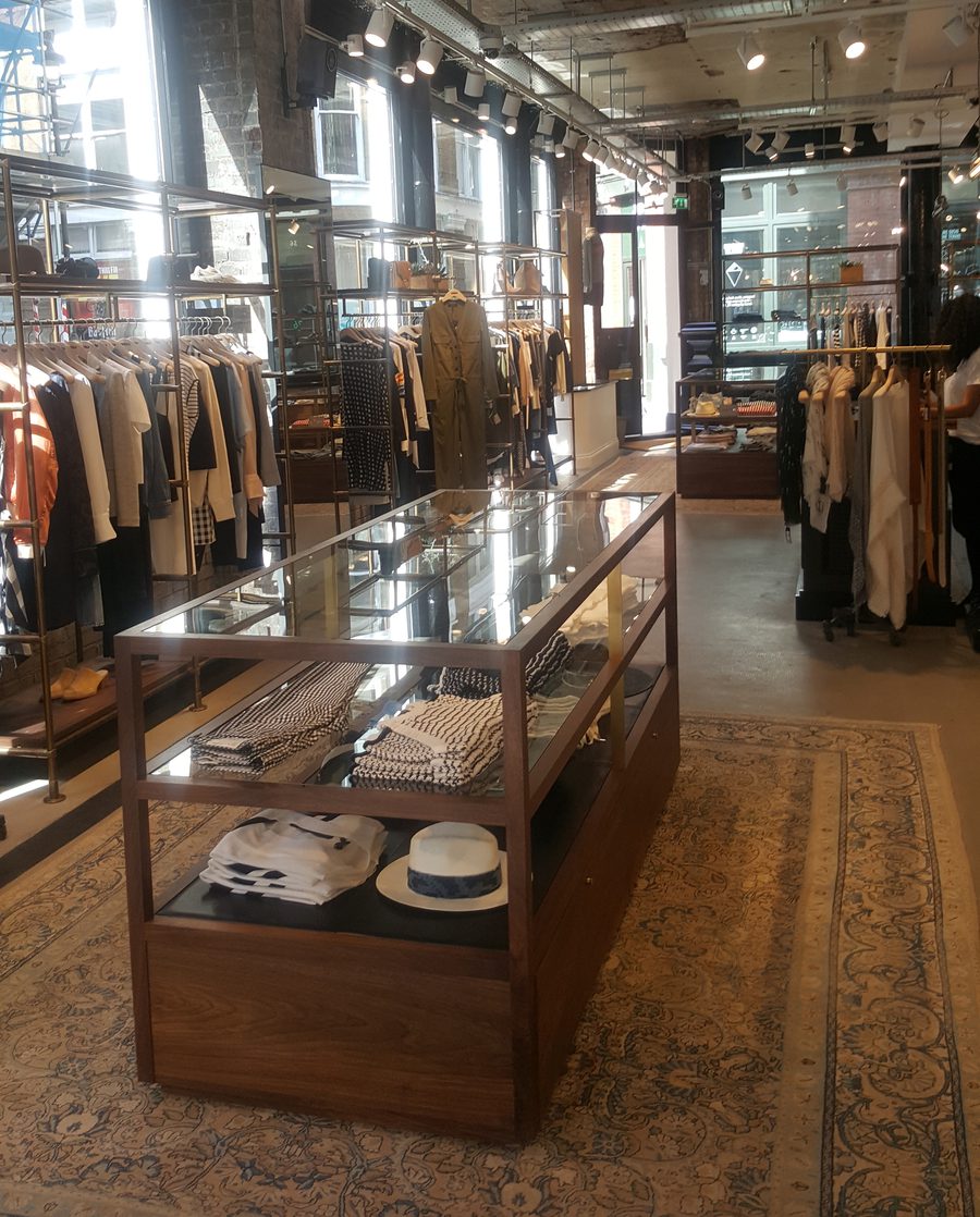
When designing the store, Creative Director Marcus Wainwright wanted to stay true to the building’s Victorian history and architecture. He said, “When we open our stores, rather than imprint Rag & Bone onto a space, we try and take the bones of it, and the history of the shop itself and weave the brand into it”
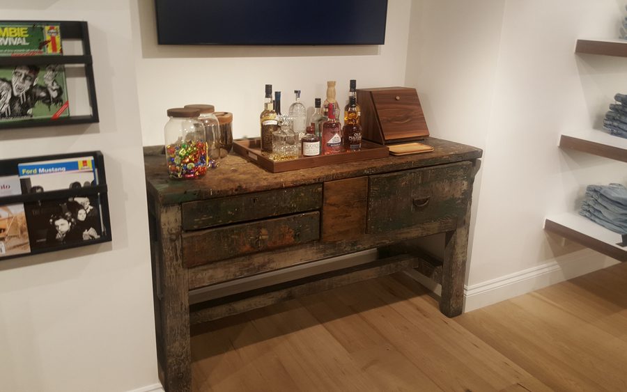
That sentiment can definitely be felt in the Soho space where the original brick walls are exposed, reclaimed British furniture is peppered throughout and the floor is strewn with the sort of decorative rugs that wouldn’t look out of place in a Dickensian parlour. However, the polished concrete floors and sleek columns nod to the airy lofts of the label’s native Manhattan. Bespoke mid-century inspired cabinets are designed by the brand’s in-house team perfectly display accessories and fragrances.
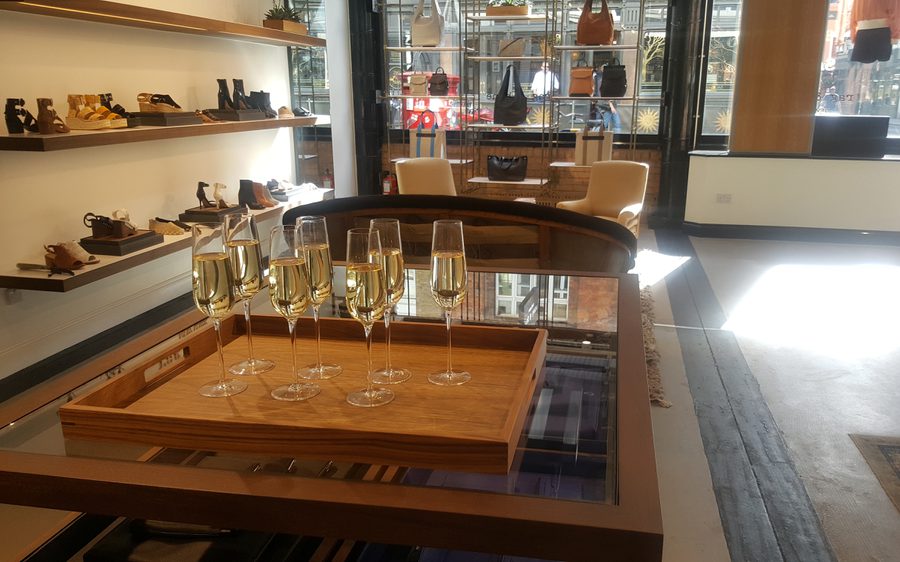
What really sets this store apart is the personalised details and level of service. Rag & Bone has realised that to engage customers in today’s market a store needs to deliver on experience. Read our Creative Director’s thoughts on consumer engagement in Retail Redefined.
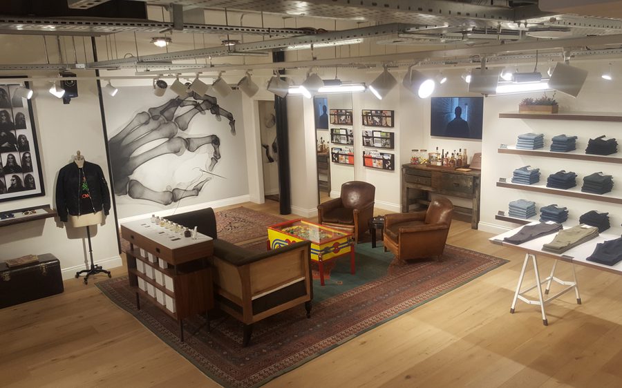
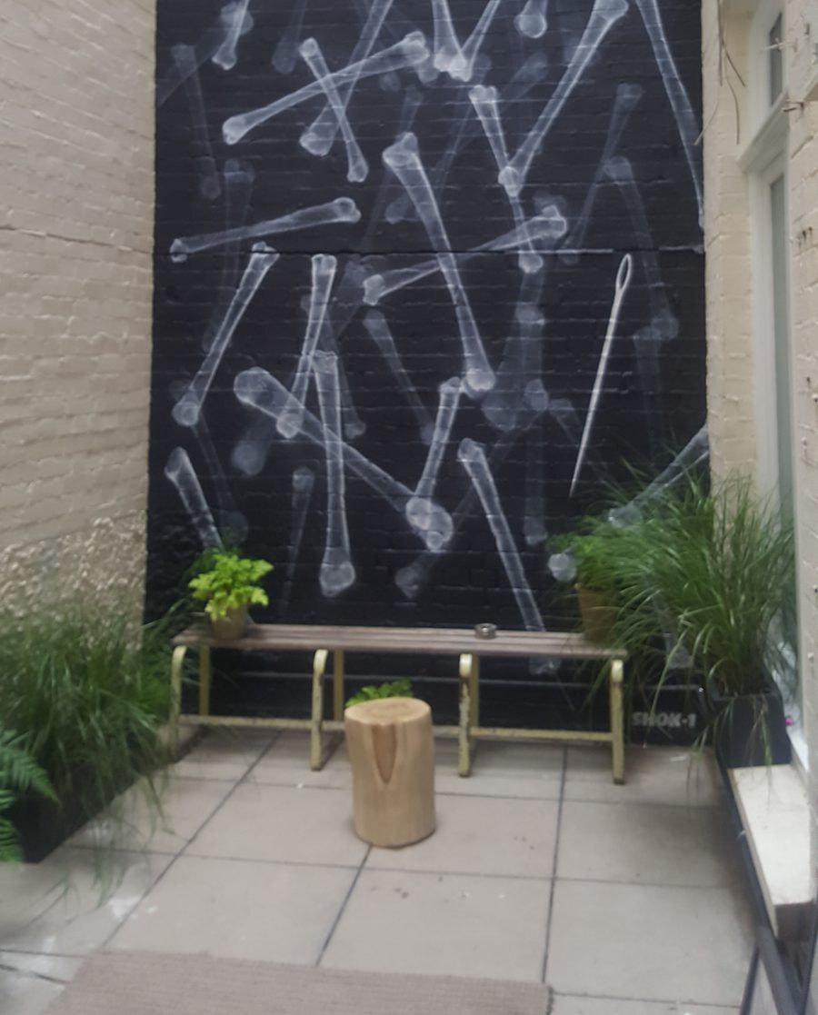
On entering Rag & Bone Soho, customers are offered a glass of prosecco, gin and tonic or whisky so they can browse leisurely or sit and read one of the magazines, coffee table books or Beano comics in several lounging spaces. Downstairs in the Men’s department there’s even a pretty little courtyard that’s overlooked by a striking graffiti wall and features tables and chairs so customers to sit down and enjoy the space. Cheeky signage and fun VM props such as the vintage pinball machine give the Men’s department its own playful vibe.
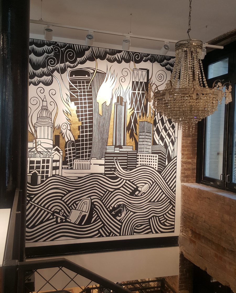
Radiohead fans will be impressed by the striking mural above the stairs that’s designed by Stanley Donwood – the artist behind of all the brand’s album covers. It depicts the London skyline being licked by illustrious gold flames and is lit by a twinkling crystal chandelier. A unique touch that lends the store it own distinct personality.
It’s good to see brands like Rag & Bone moving with the tide and elevating their level of service to suit their mid-contemporary status – and price points. Tapping into the experience economy by providing a space where customers can come and hang out with a drink is great. The store also doubles as an event space and with the press office occupying the floor above it will likely get a lot of use.