Stores we love – January
Dalziel and Pow January review of stores we love. New global retail store openings and inspiration. Click here to view this month's selection.


Dalziel and Pow January review of stores we love. New global retail store openings and inspiration. Click here to view this month's selection.


Here’s a few of our favourite new store design concepts that have caught our eye in the new year.

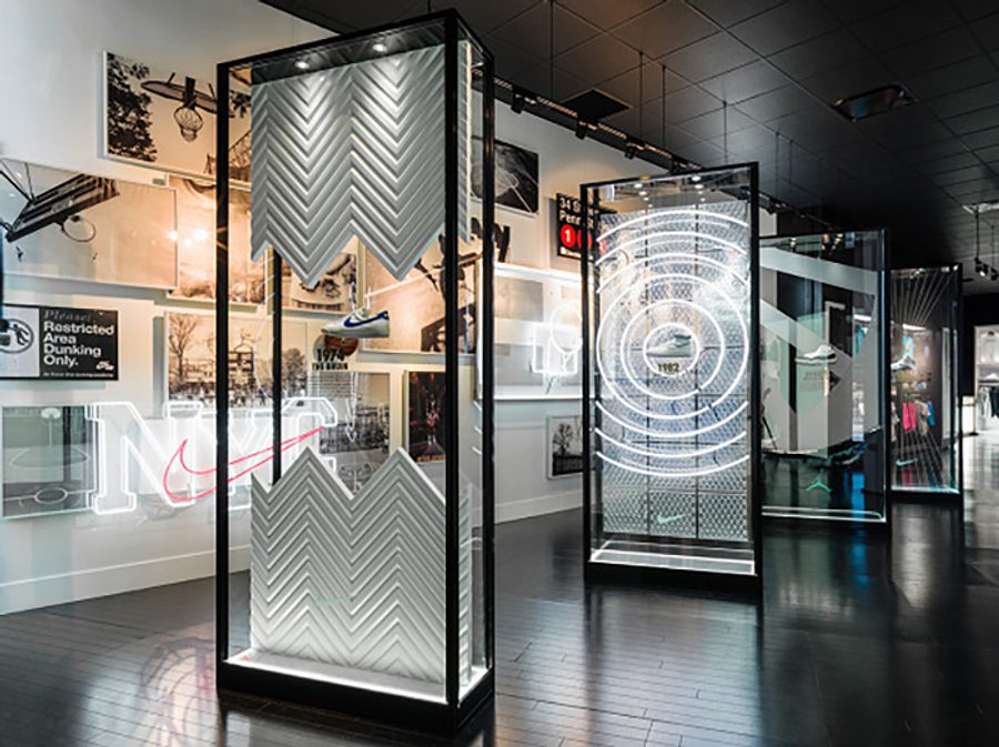
House of Hoops by Foot Locker launched a 5,100sqft pop-up store outside New York’s Madison Square Garden, home to the 2015 NBA All-Star Game next month. As well as exclusive product launches, there is a Nike basketball hub paying homage to the history of the game and its elite athletes through design imagery and neon lighting. The impressive pop-up runs until the 22nd February.

Verner’s small boutique in Melbourne’s art-deco Mitchell House keeps things simple, allowing the avant-garde clothing to speak for itself. One side of the room is partitioned by a corrugated, wafer-thin white steel wall, which becomes the backdrop for the best store feature in our opinion – hanging rails suspended by wooden rings and black rope.

Levi’s launched its first pop-up store dedicated to trendy and affordable diffusion collection Line 8, in London’s fashionable Shoreditch area. The range’s raw yet contemporary aesthetic is expressed through wooden flooring and exposed brick-walls alongside modern fixtures and neon signage. Line 8 is open for the next five months, perfectly situated on the same street as alternative denim brands Edwin and Denham.

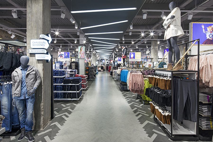
We’ve shaken up Primark’s usual formula by designing a fashion-only boutique concept in the Belgian capital. By far its smallest flagship to date at 18,000sqft, the bijou store features gloss black and metallic finishes for a more premium feel, and head-to-toe styling inspiration via high-level mannequins showcasing complete, mixed merchandise looks. We’re especially proud of the bold installation in the atrium combining a city map with neon signage in the brand’s signature aqua.

After the success of & Other Stories in Europe, the H&M and COS sister brand has made its way to America, opening in November last year. Styled and merchandised similarly to the European stores, we couldn’t resist taking a look when we were in New York and were particularly inspired by the beauty department; we love the new edition of large coloured overhead signs made to resemble nail varnish test cards. If you’re curious about more exciting beauty retail, follow us on Twitter #DandPLovesBeauty to see other concepts that have caught our eye ahead of a special sector insight report next month.