Stores we love – August 2015
Dalziel and Pow's August review of stores we love includes the likes of Birchbox, Marni, A.P.C., Target and Maison Mara. Click here to find out more.

Dalziel and Pow's August review of stores we love includes the likes of Birchbox, Marni, A.P.C., Target and Maison Mara. Click here to find out more.


A number of luxury concept stores blending opulent materials and dramatic lighting have impressed us this month, along with an innovative new showcase for smart home electronics. Take a look at our pick…

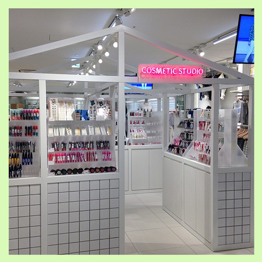
Dynamic US beauty retailer Birchbox joined forces with Gap to open summer beauty pop-ups in seven stores across America – San Francisco, Houston, LA, Chicago, and three New York locations. Similar to Birchbox’s Soho store, visitors can shop a selection of top beauty essentials, build their own Birchbox and/or purchase one of the brand’s beauty subscriptions that deliver personalised beauty, grooming and lifestyle samples tailored to your online profile.
What we love:
We are excited to see Birchbox broadening its retail presence and collaborating with brands beyond its monthly subscription service. Birchbox, now a cult beauty supplier to women and expanding their male grooming credentials, is championing a passionate awareness among consumers 24/7.
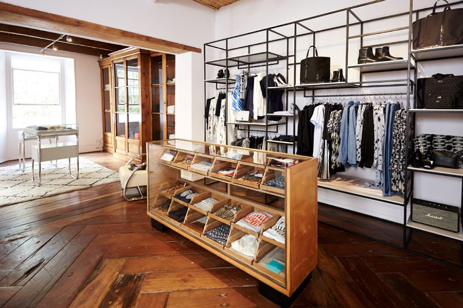
Maison Mara reminds us of Miami’s The Webster boutique, but executed with a relaxed South African attitude. Opening in a three-storey heritage building back in the spring, the boutique is one of the first luxury fashion concept stores to open in the city so far. Visitors are encouraged to explore the light home-style settings, taking time to discover the carefully curated clothing collections within each room.
What we love:
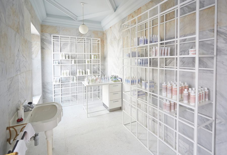
The warm, homely feel of a contemporary private residence is maintained through lovingly restored features such as the wooden floors throughout, complemented with modern fixtures and hand-picked vintage furniture. Our favourite feature has to be the skincare room, where the entire space has been encased in marble, offset with geometric shelving.

Nestled below street level in Sydney’s upmarket Surrey Hills area, A.P.C. has opened its second Australian store, following Melbourne in 2014. The new store design is in keeping with its signature aesthetic of pale wood, concrete and warm lighting, and draws shoppers in with a statement glass facade.
What we love:
Upon entering the store, two large cement screens define the geometry of the space. These store perimeters converge towards a window at the back of the store, providing a second source of natural light. A.P.C. has really utilised the basement space, turning the shortage of natural light into a clever store feature.
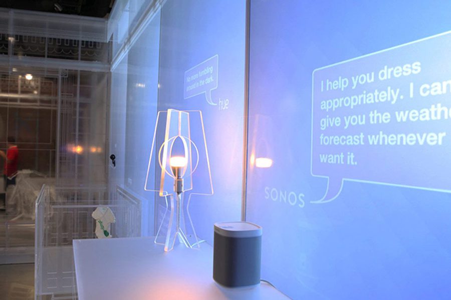
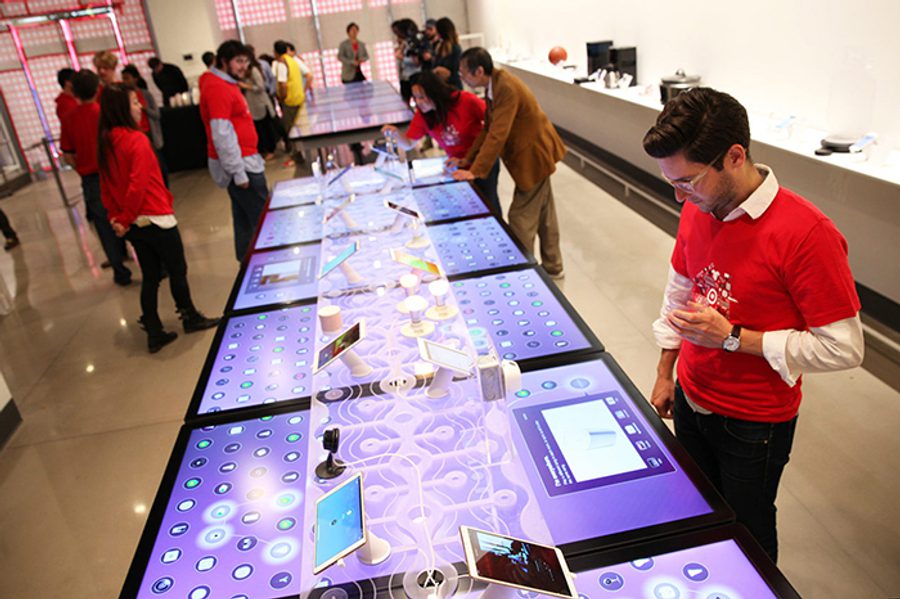
Open House is a new “part retail space, part lab” opened by Target earlier this month. It is dedicated to showcasing and selling 50 different smart home devices by well-known brands and smaller tech start-ups. The 3,500sqft space is split into two – on one side interactive displays activate when visitors approach, and on the other transparent perspex forms the outline of fake room sets showcasing devices within ‘real-life’ scenarios. The connected products are set up to show how they can be synced together: “Visitors can see how a baby stirring [via a baby monitor] prompts soothing music on the sound system and a pot of joe brewing in the kitchen.”
What we love:
Not only is the space being used as a technical playground for consumers to play with connected devices, but Target is also hosting talks and events in the space – educating, informing and influencing the future of connected home purchases.
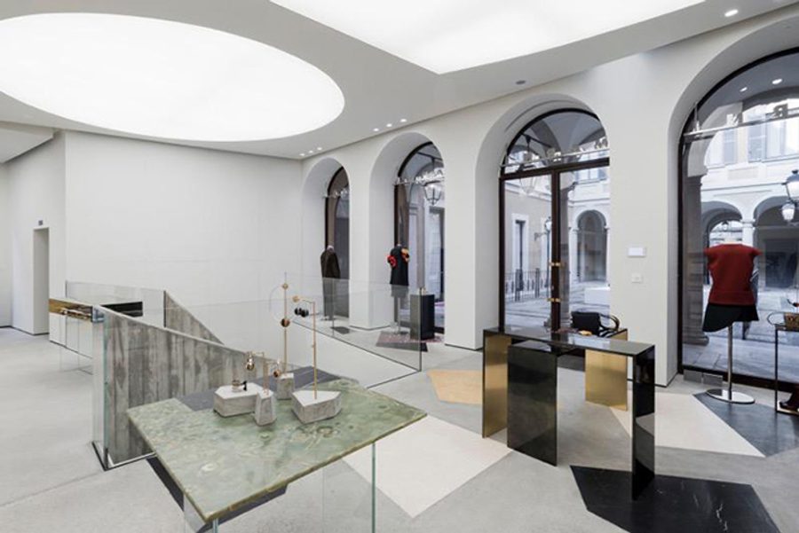
Italian fashion brand Marni has relocated its flagship to a spacious downtown palazzo steeped in Milanese opulence, asserting its cult luxury status. ‘Marni Prisma’ – a series of high-profile events marking the brand’s 20th anniversary – is the design inspiration for the store, borrowing the same geometric shapes, materials and vibe.
What we love:
Customer-brand immersion is at an all-time high here. The box-shaped geometric room opens in all directions, mixing a contrasting palette of colours and materials such as marble, mirror and brass. Our favourite feature is the expansive ceiling lighting that creates the illusion of natural light flooding into the space via skylights.
Look out for:

Delivering monthly boxes to your doorstep isn’t enough for Birchbox – it wants to take the full experience on a US summer road trip outside of its Soho New York residency, bringing Birchbox and Birchbox Man pop-ups to three different customer-voted locations in August. If only we could enter London!