No Noise at Selfridges
We review the 'No Noise' shop window campaign by Selfridges. Retail opinion posts from Dalziel & Pow. A leading retail design agency.


We review the 'No Noise' shop window campaign by Selfridges. Retail opinion posts from Dalziel & Pow. A leading retail design agency.


In the manic chaos of the January sales, Selfridges launched a ‘No Noise’ campaign with some very cute initiatives.

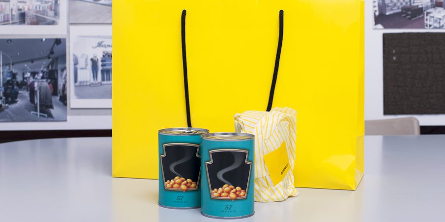
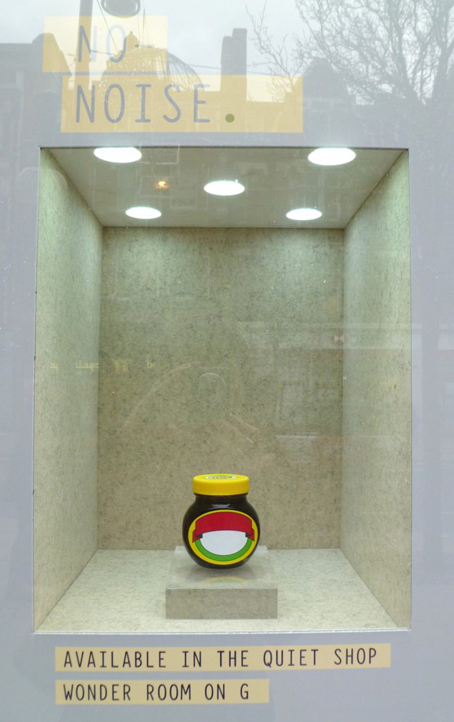
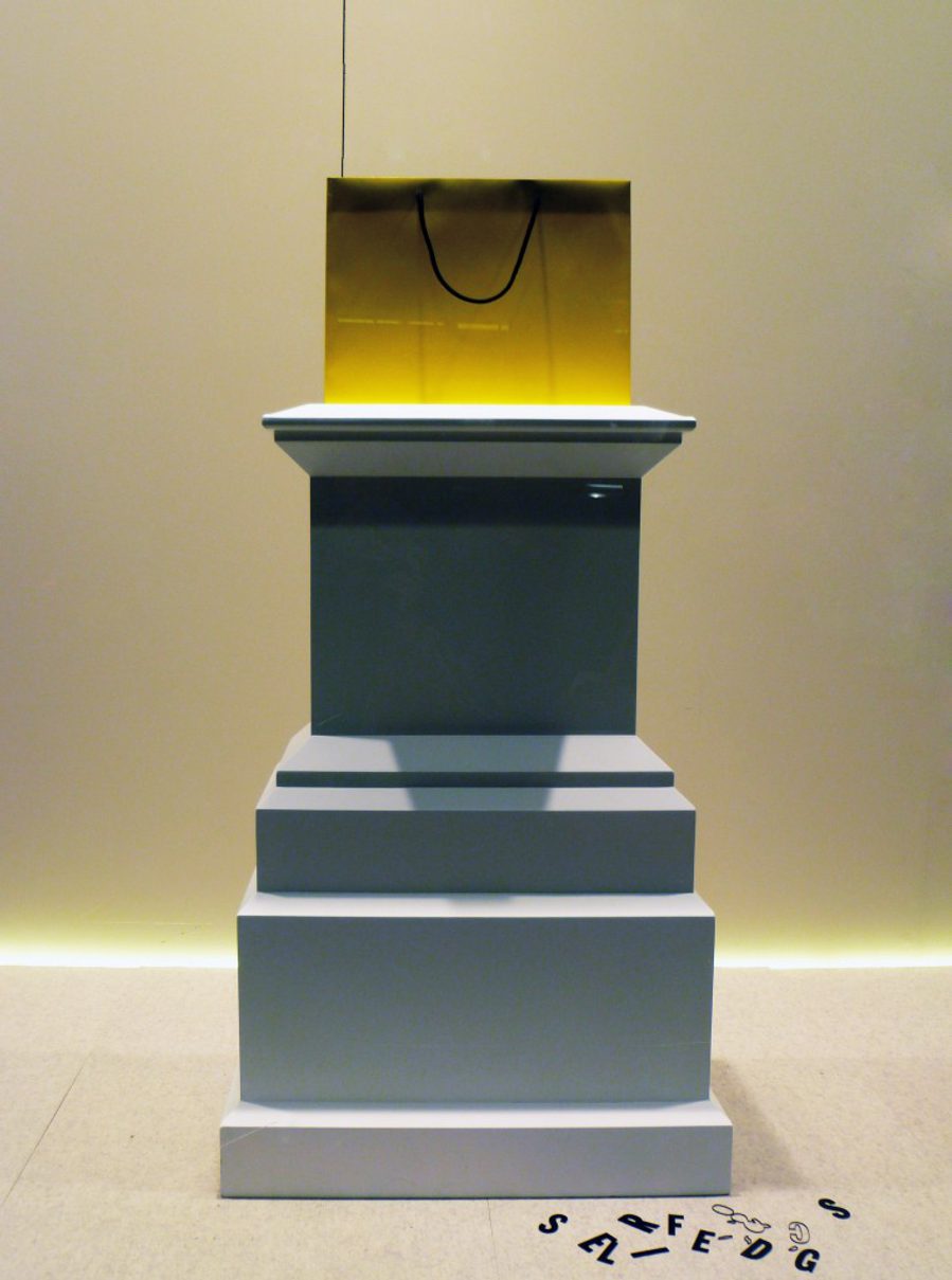
A microsite within its website tells the story of a quiet space where people can escape from the excess of stimulation and information. The windows are pared down to present singular, minimal items with great clarity. A shop-in-shop presents products that are edited from the range, to create a pure and calming experience. Individual products are de-branded to present familiar packages that will become collectors’ items in the future. A basement space has been created as a sanctuary – a place of reflection and recovery – you even have to redeem your mobile phones and shoes before you are allowed to enter!
All of these very smart initiatives are presented on the back of ‘Mr Selfridge’, the new ITV period drama about the creator of Selfridges. Seemingly, it was Mr Selfridge’s concept to create this quiet refuge in the original plans for the store at its launch. Every episode is an inspiration for retailers, combining contemporary retail opinions and practices with a very romantic and entertaining storyline. Today’s traders can learn a lot from Mr Selfridge in 1909.
No Noise has continued in store beyond the January sales,and the concept looks like it might be relevant for some time. Slow shopping, like slow food and slow fashion, just might be the way forward.
