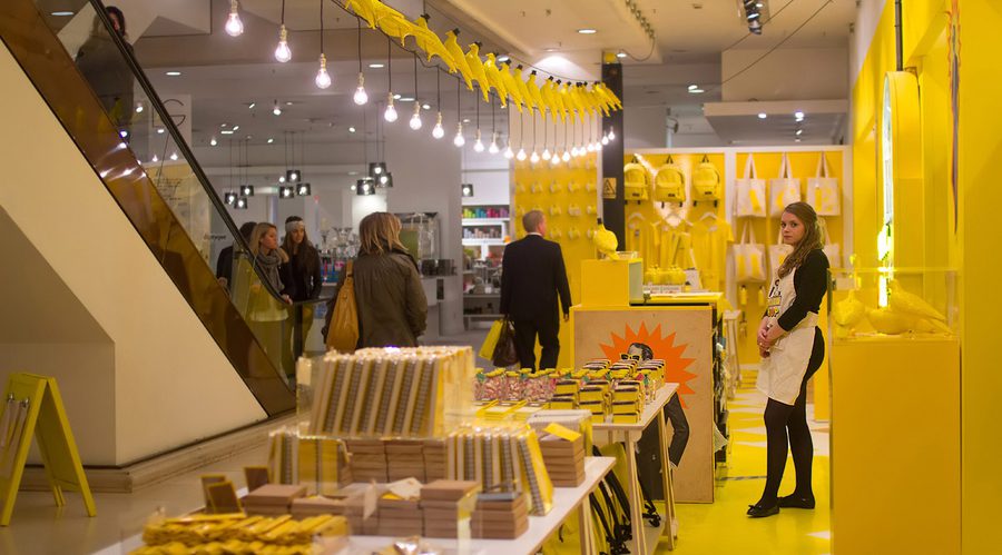
Forget Millennial Pink it’s all about Gen Z Yellow!
Associate Strategy Director, Michelle Bower, tells us why her favourite colour yellow is the new rival to millennial pink.


Associate Strategy Director, Michelle Bower, tells us why her favourite colour yellow is the new rival to millennial pink.


It’s no secret that I like yellow. Gold, buttercup, mustard, mango or daffodil – you name it I’m magnetically drawn to it.
Here’s a dollop of yellow goodness from around the world of retail – take a look at how these optimistic gender-neutral beacons shine out in the fast-moving and uncertain world. Debateable, whether we can agree that it’s ‘Gen-Z’ yellow, or simply the visual Vit-D we all need a healthy dose of.

Raf Simmons and long-time collaborator, American artist Sterling Ruby, turn Calvin Klien’s signature minimalism on its head with this vividly painted store. The concept is set to come to Calvin Klien’s Dover Street store soon.
Gymbox

Gymbox’s eye-catching interior comes courtesy of Hacienda (the legendary Manchester nightclub) alumni Patrick McKinney of architectural studio A Modern Practice. This makes me wonder, are gyms the new clubs?
Selfridges

Selfridges has long championed the brightest of all yellows and over the years has hosted a number of initiatives in the hue’s honour. Greatest hits include the wool-inspired marketing stunt in 2010 (complete with a flock of dyed yellow sheep), the Big Yellow Pantone 109 shop, and a click and collect drive-through scheme featuring yellow Minis.

This year Selfridges announced a coffee cup recycling scheme for its bags for life – so you can now carry the canary signature with a little less guilt!

The Color Factory, a pop-up experience in San Fransico, features a range of immersive exhibitions from various artists. It promises guests will lose themselves in the vibrantly pigmented spaces.

Just a lick of yellow paint gives premium menswear brand Albam’s Soho store an altogether more appealing look.

Churros are an inherently joyous food, and that’s only enhanced by this warm and inviting store (and Pinterest favourite) Churro Bunny – the sunflowers make a perfect finisher!

This energetic shade perfectly suits fas-food restaurant Ham on Wheel’s raison d’etre – to provide authentic, yet fast Catalonian food to customers.

Could there have been a better way for Kate Spade’s pop-up to make an instant impact than with this citrus-coloured store? It certainly exudes good vibes.
Start tuning in to yellow and see how brands are using this sunny optimism to attract new customers, and radiate out a little more brightness in our lives.

The first ever SXSW London took over Shoreditch this month, offering a wealth of inspiration and insights across tech, business and culture. We share our thinking into how it can return even bigger and better for 2026.

