Cole & Mason celebrates centenary with new store concept and packaging
The new experience aims to encourage a new generation of cooks to get to know the brand.


The new experience aims to encourage a new generation of cooks to get to know the brand.


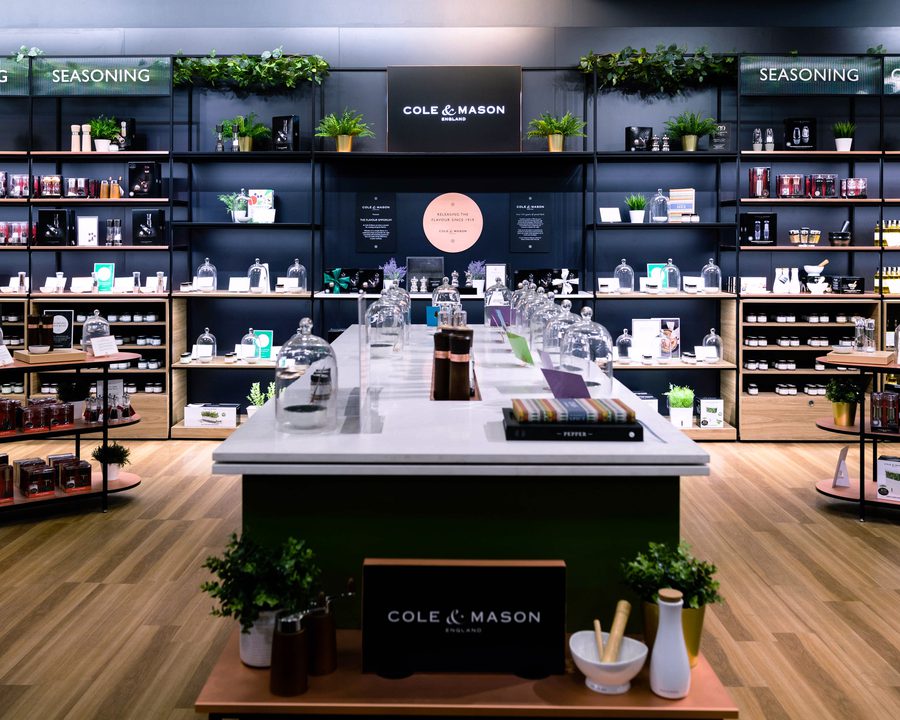
We've designed a shop-in-shop concept and created new packaging for heritage British brand Cole & Mason in celebration of its 100th birthday. The concept recently opened in Myer’s Sydney City location.
To kick off a new centenary, Cole & Mason has taken its first steps to build a direct-to-consumer brand with a new retail strategy and a bold ambition to transform from a business that’s known for its hardware into one that’s synonymous with flavour. We worked with the brand to create ‘The Flavour Emporium’ - a retail experience vision that encourages a new generation of cooks to get to know the brand and its product collection, which included launching an extensive range of gourmet consumable items.

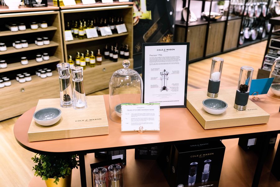
Engaging customers with the store are 3 key experience pillars: The Cook’s Collection, The Taste Library and The Experimental Kitchen. The Cook’s Collection showcases Cole & Mason’s technical credentials and kitchenware. The Taste Library is the destination for flavour, housing all the ingredients that customers might need. Situated at the centre of the concept is The Experimental Kitchen, a space that encourages people to be creative, inviting them to experiment with food, create their own blends or attend master classes.

Designed as a contemporary take on a heritage kitchen, the concept references Georgian kitchens to tell Cole & Mason’s story as an established brand. Wardrobe-style units are used rather than traditional retail fixtures and heritage floor tiles further immerse customers. Expressive touches such as foliage, colour and texture capture the vibrancy of flavour and creativity of Cole & Mason’s experts. Messaging for the store is based on the packaging design, using the same imagery and typography for the visual language.
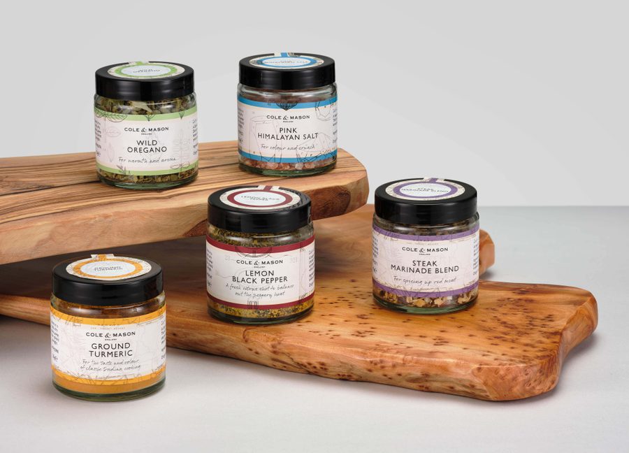
Packaging for Cole & Mason’s new range of ingredients also uses a mix of contemporary and traditional design language, perfectly suiting the heritage brand’s new era. Cole & Mason developed products in six categories of consumables and we designed a distinct identity for each. Historical image archives were explored to find relevant illustrations for each label; for example, vintage maps are used on spice labels while salts are decorated with Victorian crystal illustrations. Each category has its own colour, taken from the modern colour scheme we developed for the store. Labels wrap around jars and are placed on lids, making each jar easy to identify whether placed on a shelf or in a drawer.


The experience principles and strategy of the store design also influenced the UX for the website. The segmented retail offer determines site navigation - customers searching for kitchen hardware can shop The Cook’s Collection category while The Taste Library is where all ingredients can be found. The communications design influenced the UI of the site, aligning the online visual identity with the brand’s physical identity.
“With the fast-paced change in consumer shopping behaviour and the impact on slow-to-change retailers, we wanted to be proactive in taking control of how our brand is presented; online, in traditional stores and stand-alone. Dalziel & Pow delivered a multi-channel, scalable solution that combines product presentation, interactivity and brand elevation. It has been universally well received and has been the catalyst for securing branded areas in some of our largest retailers in the UK and USA, and now the implementation of our largest ever brand execution (8m x 6m) in Myer Australia’s flagship store in central Sydney. We have ambitious roll out plans and are confident we have a winning design blueprint for success” - Joe Brawn, Brand Lead at Cole & Mason.
Cole and Mason opened in Myer’s Sydney store on 24th October.