In most local pharmacies, to collect a prescription, you’ll find yourself journeying to the back of the store, past mountains of uninspiringly presented product to a counter, covered in strange suggested ‘impulse’ purchases like Dora The Explorer tissues, questionable sugar-free strawberry cream sweets or sparkly nail clippers. After a bit of glancing around, you finally ask for your much-needed prescription. This can be the most frustrating part of any pharmacy experience – the dreaded 15-minute wait as you’re handed a raffle ticket-style number and told to wait to be called. You look around for a seat (you know the sort, a green fabric one with foam bursting through weathered holes), only to find it already occupied.
As someone that’s dependant on regular medication, I can’t help but think that it’s time for a pharmacy revamp. Here are some steps to consider when thinking about future-proofing pharmacies.

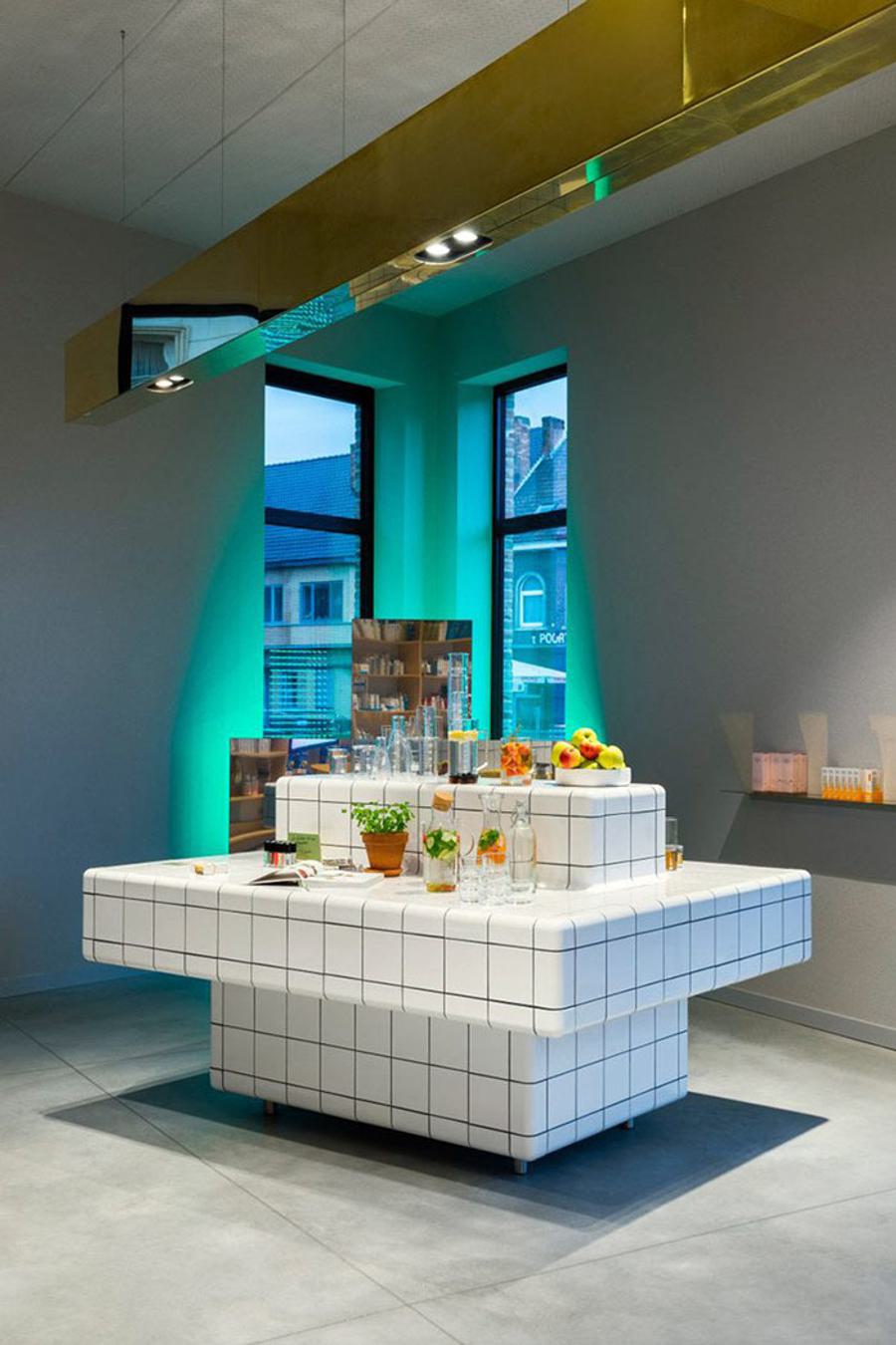
That 15 minutes of waiting for your prescription could be better spent if we designed spaces made for those 15 minutes. Think comfortable seating, or take cues from Joeri Van Dijck’s pharmacy design that encourages conversation around large tables.
Service lies at the heart of any pharmacy experience. However, the archaic prescription process needs an update. There are some things that we simply can’t change due to pharmaceutical regulations, but I’m sure there are some tweaks we could make to the current process (points finger at raffle ticket number). Apps like DIMEC allow the consumer to insert their prescription needs on their mobile. What if pharmacies worked with apps like this, and instead of clutching that raffle ticket with fear of losing it, you simply touch your phone onto an NFC enabled pad when arriving to alert the pharmacist you are ready for your medication? Simple twists like this could shorten that wait time, and make for a more seamless experience.

So we know the majority of people entering a pharmacy are going to feel a bit ill but that doesn’t mean the design has to be. MaPharmacie in Paris has created a space that actually looks alive and well. The foliage in store creates an all-around wellness vibe, making for a far more positive experience for the consumer.
A little TLC can go a long way, especially when it comes to curating and merchandising product. Pharmacies have a captive audience – but their mindset won’t always be in shopping mode. How do we create an engaging experience that promotes general care and wellness? Mountains of product certainly won’t do this. Take cues from places like Fabled on Tottenham Court Road, where product is carefully curated and oozes modern cues.
These are just some of the changes that could be made to pharmacies to make the experience more seamless and to make the retail environment equipped for consumers who have to wait in store.

You step inside the store and tap in using your phone to trigger the prescription pickup process. At the hub of the store, you’ll find a counter, surrounded by carefully considered products that are curated based on health needs. To the left is a comfortable seating area, punctuated by plants and wellness magazines to browse. You glance at your phone and notice you’ve only got 10 minutes left until your medication is ready. You head over to look at the product that the store has to offer and find yourself drawn to a section of curated footcare products (and you don’t even notice the fungal nail cream!). Before you know it, 10 minutes is up, and you stroll over to the medication pick up point, purchase some extras, and make your way out of the store. Seamless, feeling well, and more relaxed than when you entered a pharmacy in 2018.