Best openings of 2013
We look back at 2013 and reveal the best store design openings from around the world. Take a look at our final pick. Dalziel & Pow


We look back at 2013 and reveal the best store design openings from around the world. Take a look at our final pick. Dalziel & Pow


It is rare to see an offer where digital disciplines are so integrated with the customer journey and the store experience. Argos takes a model, which was being challenged, to respond to changing customer expectations and exceeds them. The pilot stores have a raw honesty about the architecture that lets the digital communications stand out. The space is completely immersive, where moving images can adapt to messages and seasons to create a ‘takeover’ in any given moment. Customers are surprisingly amenable to such change, embracing the new with a newfound love for the brand and its vast product range.

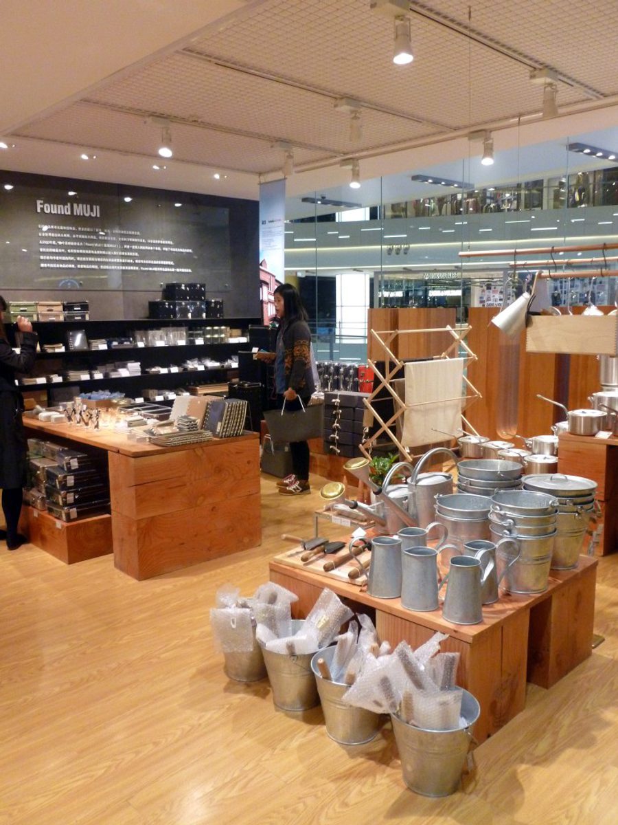
In the autumn of 2013 Muji opened a hugely impressive store in the new IAPM mall in Shanghai. The mall is world class and the Muji store doesn’t disappoint. Feeling more like a lifestyle department store than a rollout of its standard approach, it has the quality, range and scale of a regional flagship. As with any great flagship, it offers more than just a shop, with gallery spaces, customisation and curation, and surprises at every turn. The architecture is free flowing from room to room, each space housing an abundance of stock in a very ordered and disciplined way, but leaving enough room for brand expression to engage the customer.

Theory has been majority owned by Fast Retailing, the owner of Uniqlo in Japan since 2003, and in that time it has enhanced its design credentials with some very ambitious and distinctive flagships, the most recent of which is the magnificent Melrose Avenue store in West Hollywood. The store is very sharp and bold on the street, hinting at the very controlled and pure interior beyond. The architecture of the corner site lends itself to the abstract interconnection of some very clear and precious rooms for each range and collection. The commitment to quality here is impressive. Each element of the space supports the brand’s premium position.
