Balabala unveils our new identity and store concept
Our playful total brand concept is a bold statement for the popular childrenswear brand and will be rolled out across China.

Our playful total brand concept is a bold statement for the popular childrenswear brand and will be rolled out across China.

Children’s fashion retailer Balabala has unveiled the new brand identity and store experience we designed for them with the opening of its Wanda Plaza store in Huishan, China. The new identity and concept we created is bold, playful, fashionable and full of character - truly reflective of the brand's purpose and attitude.
The Chinese brand, whose clothing offer spans newborns to young teens, wanted its identity and stores to better reflect its fashionable positioning. Dedicated to quality, Balabala aims to create clothes that are stylish yet comfortable so children can enjoy being children, playing and dreaming big. We created the experience vision ‘Together we dream’ to appeal to both children and their parents, creating a space akin to the fashion brands parents love to shop in whilst also delighting children and sparking their imagination.

‘Together we dream’ was inspired by the creative direction for the brand’s product, with unexpected pairings being key to the strategy and expressed in the design language - materials found together are patterned and plain, reflective and matte, rough and smooth, and the shapes are hard and soft. This idea of contrast is also core to the brand’s new identity, which is created using two simple forms - a circle and a rectangle. The shapes are used to inform patterns, animations, characters, and the shape and form of furniture in the store environment.
The identity truly brings everything together across all channels and reflects Balabala’s joyful and fashion-forward brand position. To complement the brand’s signature yellow, a colour palette was created for use in the space with a playful approach to naming to appeal to the brand’s young shoppers, resulting in shades such as ‘candyfloss’, ‘orange juice’ and ‘snow’.

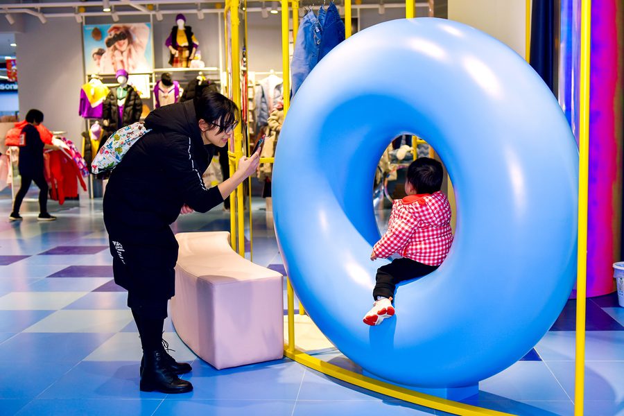
Inspired by the way social media grids work, collections are displayed on fixtures framed by grid panelling that runs throughout the space. Feature panels are mounted on wheels so the displays are able to rotate, adding flexibility and freshness to the feel of the store. To contrast with the metal grid, large circles are painted on the perimeter to add more colour and soften the space. Inflated shapes are landed throughout, adding moments of surprise and providing spaces for children to sit and play. Balabala’s brand yellow is used for oversized and exaggerated fixing details - a simple device creating a common thread and the narrative that the brand is holding everything together.

We designed characterful signage and navigation for the store, incorporating the brand’s inventive collection names and bringing in a fresh tone of voice. New communications were also developed to allow for better product storytelling as up until now, Balabala spoke little of their product features and benefits. The new concept encourages the brand to communicate their quality and thoughtful design to shoppers in-store.

The front of the store delivers a constant stream of newness to entice Chinese shoppers. Eye-catching screens play footage of Balabala’s catwalk shows from global Fashion Week events and their new campaign launches. The central statement table displays the latest trends and launches, with an emphasis on lifestyle.

In the middle of the store is the Infinity Wardrobe - a 360° rotating display of outfits creating a mix and match approach to outfit combinations, perfect for inspiring Balabala’s fashion-conscious shopper.

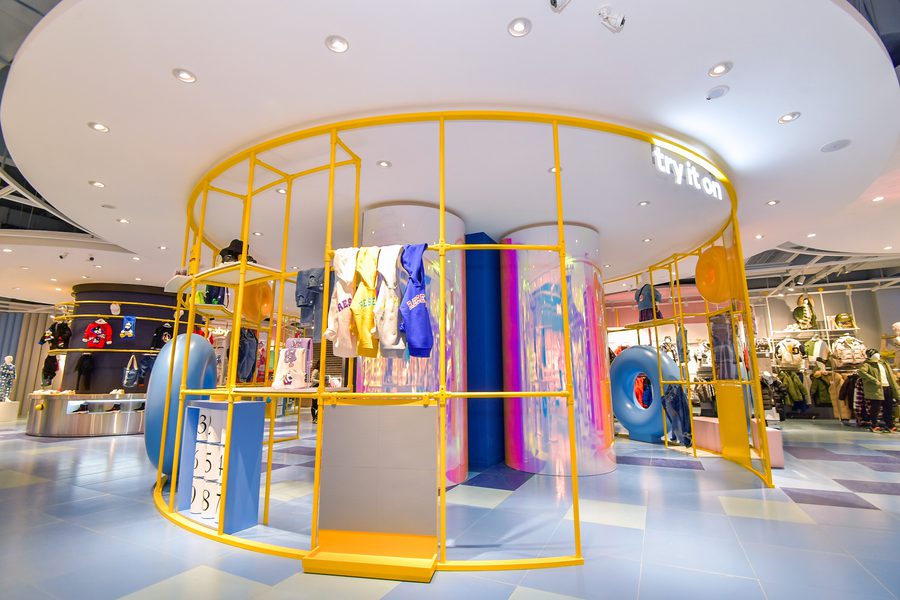
A tall yellow circular framework creates a clear destination for service and fitting rooms, turning trying-on clothes into a family moment and reflecting the brand’s extroverted personality. Iridescent cylinders within the zone create quirky changing pods, which are surrounded by seating, merchandise and playful activations such as claw machines to keep children entertained, along with payment and a personalisation station. The dedicated space allows customers to browse the range of Balabala’s customisation services.

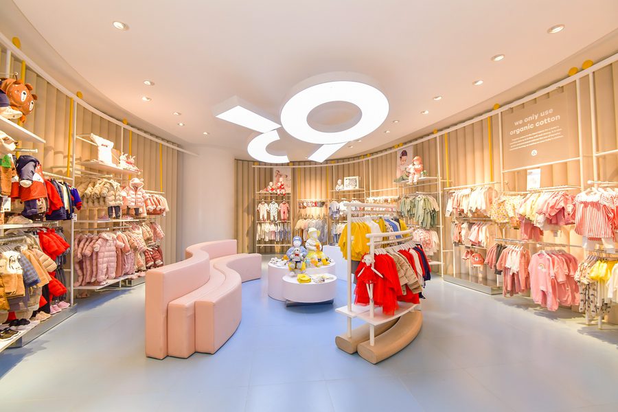
The Baby Department at the back of the store is a cosy destination. Designed to be a much calmer space, the walls are covered in pastel, soft-felt panels and playful lighting and seating is provided for families to relax. Product stories such as the use of organic cotton are highlighted and customers can also use the private parent and baby feeding and changing room located in the space.
The concept is a bold and fresh statement for Balabala and will be rolled out across China.